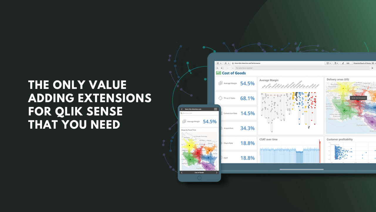
Data analysis and organization are vital in the business world. Of course, if you use Qlik Sense, you already know this. However, there are ways to make Qlik Sense work even better by extending the amount of analysis and filtering through the data more uniquely.
There are hundreds of extensions for Qlik Sense, with different features, functionality, and applications. Some manage your data items, and others renew specific tasks. However, not every Qlik Sense extension will add value to your Qlik Sense account. Keep reading as we identify our top five and how they could benefit you.
Table of Contents
5 Qlik Sense Extensions That Help
Here are five Qlik Sense extensions that could enhance your overall experience. We have parsed the many extensions offered by Qlik Sense users and community forums to identify those that can fulfill all your needs in charting, visual aids, writeback, and team communication. There’s no need to try out hundreds of different extensions—pick one or two of these, and you’ll be set.
Vizlib Library
Vizlib Library remains the most popular free extension for Qlik Sense. It not only helps to visualize the data stored and sorted in a Qlik Sense library, but it can also animate the data to show changes and potential growth in charts or visualizations. Vizlib offers multiple types of free charts and is free for up to five users.
Vizlib Library provides a free tool for up to five Qlik Sense users and is great for small business owners or marketing departments. Once Vizlib is installed, it can be easily integrated into Qlik Sense and used for powerful visual aids. The Vizlib charts can be animated, color-coded, and heat-mapped, giving users multi-faceted visualization.
The charts in the Vizlib library are the main draw and the reason most people download the software. These include waterfall charts pie charts and other visuals. However, Vizlib delivers more than just visual templates. In particular, you can make your data more accessible in your Qlik Sense.
Vizlib integrates workflows inside the Qlik app, which is more convenient for team members than having a separate app for employees. With the Vizlib workflow, it’s possible to attach tasks to specific pieces of data, spreadsheets, or charts. Moreover, the software doesn’t require coding on any level, although it does have tips for those starting out with Vizlib.
With intuitive searching, data tips, and an advanced writeback system, you can accomplish all of your data-related needs in the same app. This extension can help with more than just visualization, which makes it one of the most versatile and useful Qlik Sense extensions available.
AnyChart Extension
The AnyChart extension for Qlik Sense is one of the most popular and versatile charting extensions available. It extends the charting and visualization capabilities of Qlik Sense far beyond the traditional and makes it straightforward for any team member to see and understand the data you’re storing.
AnyChart is a paid subscription featuring 36 different types of charts. You can visualize your information with pie charts, bar graphs, or more intricate visuals, such as tank gauges, heat maps, and candlestick charts. Each of these is customizable with different colors, styles, and shapes.
Because the charts are powered by Qlik Sense itself, you’ll be able to quickly put your existing information in whatever type of charts you need. You can organize and analyze information further, pulling out chunks of the data you have stored to insert it into the proper charts. No coding is required, making the system accessible for anyone to learn and manage.
AnyChart is an essential tool if you’re working with a team or need to give a presentation on your Qlik Sense data. The analysis will be easier, and presentations will be visually stunning with the colors and aids that AnyChart has. The software has won multiple data and design awards from software engineering and data visualization firms.
This extension has been one of the top data managers for 15 years, and their addition to Qlik Sense is a natural evolution of their knowledge and expertise. AnyChart is a paid extension but does have a 30-day free trial, so you can add it to your Qlik Sense account and try it out to determine if it is a worthwhile addition.
Qlik Sense Forms
With Qlik Sense Forms, you can add any task or comment directly to your Qlik Sense data. Forms enable you to make many other inputs, from varied action plans to deadlines. It allows you to batch-update rows, export, insert custom categorizations, and more. In addition, Forms stores data on a user’s server and can be accessed offline.
Instead of being focused on data visualization, Form is an extension that works mostly for writeback and communication needs. Forms can do all of that for a team leader who wants to assign deadlines, team projects, and comments. It doesn’t require coding and has intuitive, integrated buttons like Qlik Sense itself.
According to reviews and real-life users, there is virtually no limit on what can be accomplished with Forms. It doesn’t have a set list of things that it does because it’s something that you will set up on your own. That is advantageous because you won’t have extra, unnecessary functions in your Qlik Sense.
If you need charts as well as communication, you might require additional extensions. However, for team collaboration, assigning tasks and data sets, and increasing the visibility of your communications, Forms is an excellent addition to Qlik Sense.
Forms is a Qlik Trusted Extension and can be tried out with a trial download. Although it doesn’t add any charts or visualizations, it’s ideal for writeback operations and facilitating team collaboration.
Qlik Sense Dependency Wheel Chart
Although extensions like Vizlib and AnyChart offer multiple types of charts for your data, they don’t always have the most extensive catalogs. When that’s the case, you might need to download individual extensions. Fortunately, Qlik Sense has plenty of options, many of which are free or at least inexpensive.
If you want a chart depicting the dependency of certain data on other pieces of data, the Qlik Sense Dependency Wheel Chart is a great option. A dependency wheel depicts which pieces of data relate to other parts. It does so by color-coding specific interactions.
With this extension, you can select whether the colors correlate to Diverging or Sequential data. It’s also possible to choose the dimension values and how much they relate to other data. It utilizes Javascript to generate rendering and aggregations. Specifically, this dependency wheel chart leverages the open-source d3.dependencyWheels and d3 scripts. The wheel chart is fully interactive and visualizes every dependency using two-dimensional discs.
While there are multiple types of dependency charts, this extension has been workshopped to deliver deeper analysis. Although its approach to visualizing data might be overwhelming at first, hovering over the various wheels and colors will isolate relationships and make them easier to understand.
For data analysts looking to manage large amounts of correlated data, this extension can be a vital tool. There are two versions of this tool: one is free while the other comes with a fee. The latter is supported and comes with more features.
Qlik Branch Date Range Picker
So far, we’ve offered you excellent options for communication extensions, writeback extensions, and multiple charting and visualization extensions. However, Qlik Sense doesn’t have a lot to improve on when it comes to data organization. If you want to structure things more by date, check out the Qlik Branch Date Range Picker.
Although not everyone needs a dependency wheel chart to keep track of their data, dates are important no matter what sector you work in. If you have worked with Qlik Sense for a while, you may have experienced some frustration with the limited ability to choose specific dates in the app.
This extension works like the calendar app on your phone. You can choose dates from a visually simple weekly, monthly, or yearly calendar and look at data only within those dates. It’s ideal if you, an employee, or a client want to quickly look at certain subsets of data without having to code.
In addition to being convenient and easy to use (even for the non-coding customer), the date picker fits into a smaller corner of your Qlik app. You won’t need to allocate a large portion of a spreadsheet or teach your customers the ins and outs of using it. Instead, you pick the dates and let the algorithm do the rest.
Final Thoughts
Charting, communicating, and visualizing the data are all extensions of what Qlik Sense does already—storing and organizing data. By choosing a value-adding Qlik Sense extension mentioned in this list, you don’t have to worry about sorting through the hundreds of options for charting and visualizing data or reporting to your team.
Instead, you can get to what’s really important. With these extensions, your data communication, visualization, and customer integration could increase dramatically, adding more value to Qlik Sense.

I am a passionate, adventurous, and insatiate learner who loves to write about the latest technology trends. My experience working in an MNC has motivated me to understand that there are certain niche requirements for writing strategically about brands’ messages towards people’s interests which I’ve mastered over time through trial and error of many projects under various clients across diverse industries. It is my honest effort to put my experiences and knowledge of industry towards readers.